Wednesday 25 February 2009

Illustration


A Spanish illustration found in Barcelona.


I have started taking notice of illustration since late 2007. One illustrator I have always liked in particular is David Shrigley. He does very simple yet humourus drawings and has become very successful. I think illustration is also great for research and sketchbook development. The great thing about illustration is how versatile the subject is. There are so many different techniques that beginners and experts can use. Illustrations can be drawn, painted, or made using computer software such as Adobe Photoshop and Adobe Illustrator. It is greatly used in books and magazines, but is also used a lot for various pieces of artwork. One type of illustration technique I like to use is stick figures and silhouettes. It is basic but very effective, much like the artwork used on "school" signs or a fire exit. With this said, illustration is often used to provide information or decorate a piece of written work. Many types of illustration are done purely as a piece of artwork. Many pieces can be found in design museums, just as examples of what designers can create. I personally find illustration one of the better ways to be creative with art and come up with new ideas for adverts, posters, flyers and magazine covers.


Please visit these websites for some great illustration examples:


http://www.illustration.web.com/


http://www.davidshrigley.com/

Photography and Travel


Above are images taken by me in Hunstanton, United Kingdon and Barcelona, Spain.


I have studied photography since September 2003 and it has held my interest since. I used to develop the films manually in a dark room, but this has not only become expensive, but nearly obselete as digital photography is rapidly taking over. It is a bit of a shame that photography is not done manually these days, but digital does mean we do not have to buy film, only photo paper for printing. On a digital camera you can also see the image straight away, which helps you decide if you like it or not, instead of spending money on development. My personal favourite photography subjects are cars and travel. The images can become collectable, and keep track of all the places you have visited. I hope to do a lot of travelling after I have graduated so I can visit many sites of the world. A few of these places include Thailand, Mexico, Australia, Japan, France and Italy. So far I have managed to get to Spain, Greece and Dubai to do some great photography. I think travelling really makes a person, and helps them build up their confidence and experience new things. This is why it must be done at least once.

Tuesday 24 February 2009

Collage Design


Since studying graphics, one of my main techniques for many pieces of work has been collages and montages. They are very art based but I usually enhance them using computer software. A collage is usually made up of photographs leyered over each other. A montage is the same, except to be called a montage the images must be making up a bigger image of something, instead of just being a collection of images. The images do not have to be photographs. Other materials like card, string, charcoal, newspaper and glitter can be used to make a montage. The photos could also be cut up or whole. I used collaging to create magazing covers and layouts in the past, and then scanned them with photoshop to enhance the spot colour. I think collages are a great form of visual expression, as you can put just about anything you like into one, or design a highly detailed montage.
More collage examples can be found at:


Typography


I studied a National Diploma graphics course from September 2006 to June 2008. Since this time my interest in typography has developed. I had always noticed its use in signs and around the environment, but now have a more unique and creative feel for it. I like how it is used in logos and on clothing, as this can make a t-shirt or a pear of jeans look very stylish. Something that I have learned since starting my graphics course at Uni is how over used "Helvetica" is. It is possibly the most common font on signs, shops and adverts. A single piece of typography can be used as an amazing piece of artwork. The most simple letter placements can make something like a magazine cover or a logo look truly outstanding. In a previous course, I was asked to take the lyrics from a song and write then in a certain font. The font was Bauhaus, and it ended up being one of my favourite pieces of work.
More typographic art can be found at:

Architecture and building design


Since I started studying graphics at the University of East London in September 2008, I have developed an interest in architecture. Seeing many sites in and around London has really made me appreciate the subject. From a creative or artistic perspective, I realise that without buildings like the O2 Arena, London could look very dull. Even though it is not actually a building, the London eye is also designed well. I have seen many buildings around the city which take away from the usual designs. There is a slanted building near tower bridge that looks like it is tipping. There is also the bullet shaped building and Tower Bridge itself. The Tower of London is probably one of the most unique due to its age. The great thing about London and other cities alike is the mix of modern and historic building designs. I can really appreciate the creativity and effort that goes into this - even study the subject myself later on.

Pictured above, good examples of the unique architecture in London.


www.architecture.com

Car Graphics and Logos


I have always been very interested in the idea of applying graphics to certain types of cars. It would be great to learn to paint so I could apply my knowledge of graphics to a type of car vinyl design. Recently a game for the Xbox 360 came out. It is called Forza Motorsport 2. In this particular game, many different cars can be customised how you like. There are all different paint jobs and logos. The typography used is what impressed me the most. type will usually be included in the design to show the tuning company for the modifications used. For example, if a car was fitted with Yokohoma tyres, a sticker or paint job with the word "Yokohoma" could be added to the car's exterior. It is simple yet very stylish when done properly. It is a great way to show off the modifications on a car, and the companies whose parts have been used.
The above images show models sporting various logos from different tuning companies.

For classic car images and some paint jobs: http://www.munitechmotorcars.com/

Or for more car graphics: http://www.demongraphics.co.uk/

Biography: Alex Trochut


Alex Trochut is a designer who goes by the statement: more is more. Alex is very skilled at typography and illustration projects. Because of this, he has achieved a Certificate of Excellence in Type Design. It should be noted that Alex has worked with a very high amount of well known clients. Just a few of these include Adidas, Nike, Johnnie Walker, Brittish Airways, Computer Arts, Top Shop and NetWork Magazine. The illustration Alex has produced hasa very cartoon style look about it. All illustrations look digitally enhanced in some way. The typography is impressive with the simple yet very effective approach. Such an example is the new lettering designed for the Cadbury's logo. His website looks very simple on first appearance, but once a piece of artwork is selected, it shows and fills the page.


His work can be seen at http://www.debutart.com/


or his personal website, http://www.alextrochut.com/

Biography: Alan Fletcher


Alan Fletcher was a British Graphic designer who worked with many different clients during his design career. In 1963, along with Colin Forbes and Bob Gill, they produced the book Graphic Design: A Visual Comparison. Alan has also produced a cover for Fortune Magazine in the year 1958. Alan has written many other books on the subject of graphic design. In 1994 Jeremy Myersons published a book on Alan's work called Beware Wet Paint. One of the more notable clients he had worked with was a company called Pirelli. They are a company that makes robotics and tyres. Their logo design is also noticable to any typographer.

Alan's work always looks very personalised. Like most graphic designers, Alan would create a lot of projects from his own personal experiences, often with many different clients. Alan also created the logo for the Victoria and Albert Museum in London, which is still used to the present day. It should also be noted that outside of graphic design, Alan Fletcher used to teach English in Barcelona.


More information can be found at http://www.designmuseum.org/


Sadly, Alan Fletcher passed away on 21 September 2006.

Sunday 22 February 2009

Biography: Ed Fella


Ed Fella is a graphic designer who has done a lot of work with typography. He has recieved an MFA in design from the Cranbrook Academy of Art, which he achieved in the year 1987. Ed has also produced many drawn sketchbooks, which can be viewed on his personal website. A lot of his work as well as his sketchbooks seem to be hand drawn. All his work is amazingly well done. Ed has created many collages, posters and illustrations. Since recieving his MFA in design, Ed has spent a lot of his time teaching at the Calafornia Institute of the Arts. Ed has also published books, the first of which being called "Ed Fella: Letters on America". Some of his work can also be seen in the Museum of Modern Art in New York, and the National Design Museum.
The image to the right is an example of his work.
More can be found on his website: http://www.edfella.com/

Modernism/Postmodernism


I have added a photo taken on my campus, which shows
a few examples of Modernist buildings.
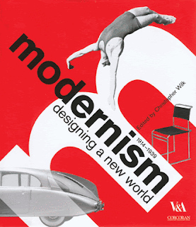
The above piece is from the Victoria & Albert Museum.

http://www.modernisminc.com/

Modernism is a great example of visual expression. It represents the artwork from different times and different cultures. Other important work related to modernism includes Architecture and drama. There are also many different types of design. If it is Postmodernism, it means that it took place after the time period in which the original Modernism took place. Modernism means it is happening in present time. It started in the 1970s in West Coast America. Because it can be from so many different times and cultures, there is somewhat of a humour about it. There are saloons set up in America as if it was still the 1800s. With modernism a building could be made to look like a money box, or someone may have a pyramid display next to their porsche - it can be what you want it to be. Postmodernism mainly began with architecture, in which building design was to not be so plain and dull. This came from the perspective that things did not have to look perfect, or all exactly the same. The idea is generally favoured by many is it allows people to express themselves. A good example of a Modernism building in London is the Millenium Dome. This is because of its unusual round shape, and that it stands out as one of the many London landmarks. It shows further creativity and a physical form of visual expression.

Semiotics


Semiotics, meaning the use of communication through signs and symbols, is used for many different things. A good example of this would be traffic signs. There are often symbols for pedestrians crossings made with silhouettes or simple stick figures. The purpose is usually to warn people of what to expect, and provide helpful information. By this I mean that signs will usually have written directions, or symbols of arrows to show a certain way. These images show examples of the written communication. I found these signs in Central London, UK and Barcelona, Spain. The one near the docks has examples of visual communication. These symbols include a fish silhouette for "no fishing" and two people in dangerous situations. These are warning signs for people not to swim in the docks or stand too close to the edge. Semiotics can also include labels on packaging and many different logos. It is also a great way to advertise, using posters, flyers, cd and dvd covers. It can also be used as a way to create very eye catching signs using just a font, or even a single Illustration.
Further information on semiotics can be found at http://www.wikipedia.org/

Monday 16 February 2009

Graffiti In The Environment


I have started looking around London for certain kinds of street art. Street art in London can be found just about anywhere. Walls, signs, street lights, roof tops and even on the pavement. It is incredible how some spray paintings are done in such high places. Although it still counts as vandalism, a lot of graffiti can be very inspiring from a creative perspective. Seeing many paintings done on walls by using stencil techniques is what makes me want to create my own work and get the ideas down on paper. Even just stickers and signs can be very creative - if used properly to suit a situation. A good example of this would be for someone to put a smiley face sticker on a pedestrian crossing sign. Many people believe there should be set areas or wall where people can create their own artwork for this particular style. If people could pay money to spray paint a wall their work may even become admired over time. When we see street art, it is hard not to think of Banksy. A street artist who has become extremely well known for his work, and even made books to document it. One of his books, Wall and Piece, shows many good examples of his work. However, Banksy has been criticised, because some see his work not as art, but glamourising vandalism. His work is mostly seen positively from a creative perspective. His work proves why we should be able to set up our own areas and pay to create street art.


A good website to visit to find images is http://www.google.co.uk/